
How to Use Colour in Your Home: A Guide
Beautiful rooms and homes are all over the internet, and it can leave you feeling that your home is not quite photo-ready. But fear not, there are some simple steps that you can take to ensure that your home is Instagram-worthy using strong coordination and some simple rules.
Colours all have different meanings and effects on our brains and bodies, so don’t be afraid to combine them to get the feel that you are looking for.
A simple trick that all designers know is the 60/30/10 rule, an effortless way of making a room seem natural but classic at the same time.
The 60/30/10 rule allows you to make your home pop! Paints, furnishing, and fixtures all combine to create an outsized impact, making your home feel sophisticated and carefully planned.
We’ll explore how to use colour in your home below, including the best colours for every room and how to use the 60/30/10 rule in practice.
Find what is fixed
Dulux always recommends beginning with the fixed features in a room. This might include fireplaces, flooring, worktops, tiles, and so on. Their colours are going to guide how you style the rest of your space; your choices should not be at odds with the fixtures of your room.
A dark floor might make the room look dim if not combined with a light main colour! But by contrasting the two, you create a great visual clash of energy.
Fixed home features can be seen as a drawback, but they are actually a charming quirk that can make your home stand out from all the rest.
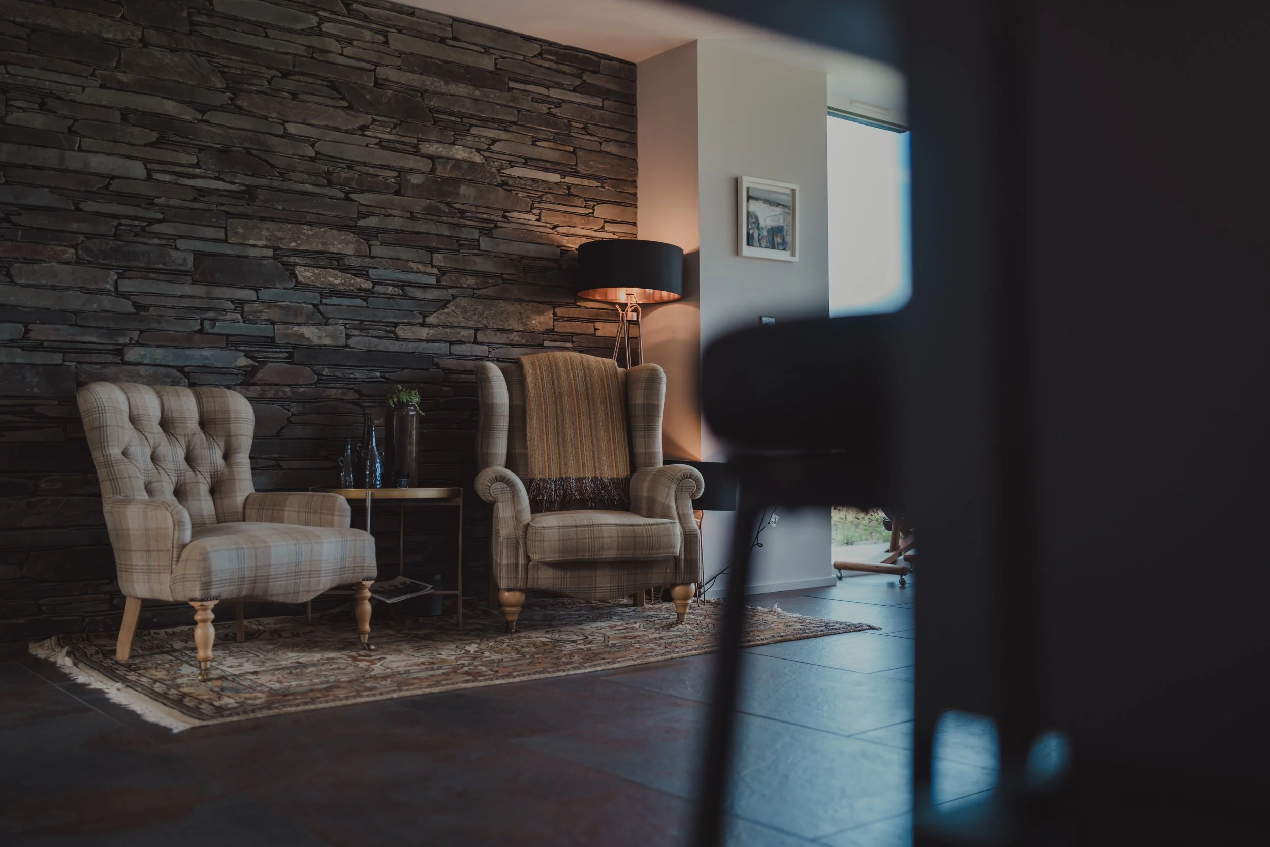
Dark fixed features can be offset with lots of natural light and light-coloured furnishings.
The Best Colours For Every Room
How should each room make you feel? We can influence how each one feels through our choice of colours.
Let's walk through colours and their impact on our emotions and behaviour.
Warm Colours
Red
Stimulates adrenaline
Pairs well with other colours
Strength, Passion, and Confidence
Red shades are ideal for a lively living room where you need your brain to be active and energetic.
Orange
Strong and eye-catching
Shares the strength of Red, while bringing the mellowness of yellow
Warm, Energetic, Inviting
A young child's room screams for orange; it gives a vibrant energy to get up and play
Yellow
Often used as an accent colour, it can be too much in large quantities
Associated with nature
Cheerful, Bright, Bold
Accenting a bedroom with an active yellow colour would be perfect! The brightness imbues energy first thing in the morning.
Cool Colours
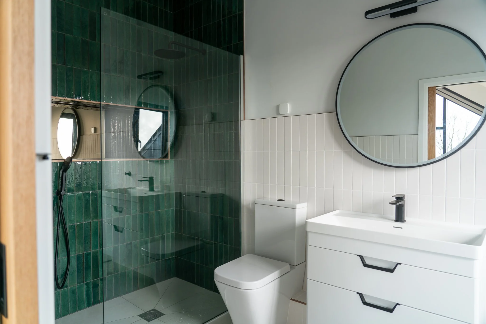
Green
Green is the most natural and comfortable colour to the eye.
Dark shades are relaxing, whereas lighter shades are refreshing.
Health, Nature, Food
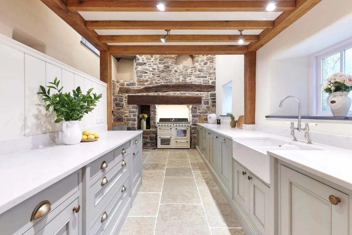
Green is often used in kitchens, and it is a perfect fit for the liveliest room in the home.
A beautiful, vibrant tile can be contrasted and complemented by a clean off-white.
Blue
A long-established and often used colour throughout history
Trustworthy, Calming, Friendly
Blue works really well in a hallway or staircase, a great first impression for any visitor.
Purple
Combining the energy of red and the mellow of blue to create something wholly new.
Often associated with royalty due to its rarity as a dye.
Luxury, Creativity, Spiritualism
A dining room in purple will bring a sophisticated feel to your tea.
Neutral Colours
Grey
Calms almost any space
Works as a great neutral colour for furniture.
Balanced, Sophistication, Quiet
If you have a really bright primary colour, grey may temper it nicely, giving equilibrium to a chaotic space.
White
It can be paired with almost anything.
Create breathing room and space for something complex
Purity, Cleanliness, Simplicity
White is most versatile colour there, because it is all of them. It should lend itself to just about any room.
Black
Black should be used as an accent or secondary colour, otherwise it could dominate.
Minimalist, Decadent, Polished
Using black sparingly! But in the right dose, it can lend a level of depth not many others can achieve.
Grey, white, and brown combine to create a bright, clean space without feeling minimalistic.
How to Choose COLOUR Combinations For Your Home
Now you know the colours and their uses, let’s put them into practice and start combining to find the perfect combinations!
The 60/30/10 rule is very common in colour design, for a good reason. It allows for balance while giving the viewer enough variety to interest the eye.
The idea is simple: 60% of your space should be the primary colour, 30% is the secondary colour, and the final 10% is an accent colour.
You can test and combine colour combinations to your heart's content with the 60/30/10 rule in mind, and find so many incredible aesthetics you would never have dreamed of.
Of course, you are not going to be dividing up your wall into exact percentages. The right furniture can set the mood, and wall art is the final complement. Together with your main colour, your space will feel just right!
The most important thing is to get the main colour right; from there, every other colour should fall into place.
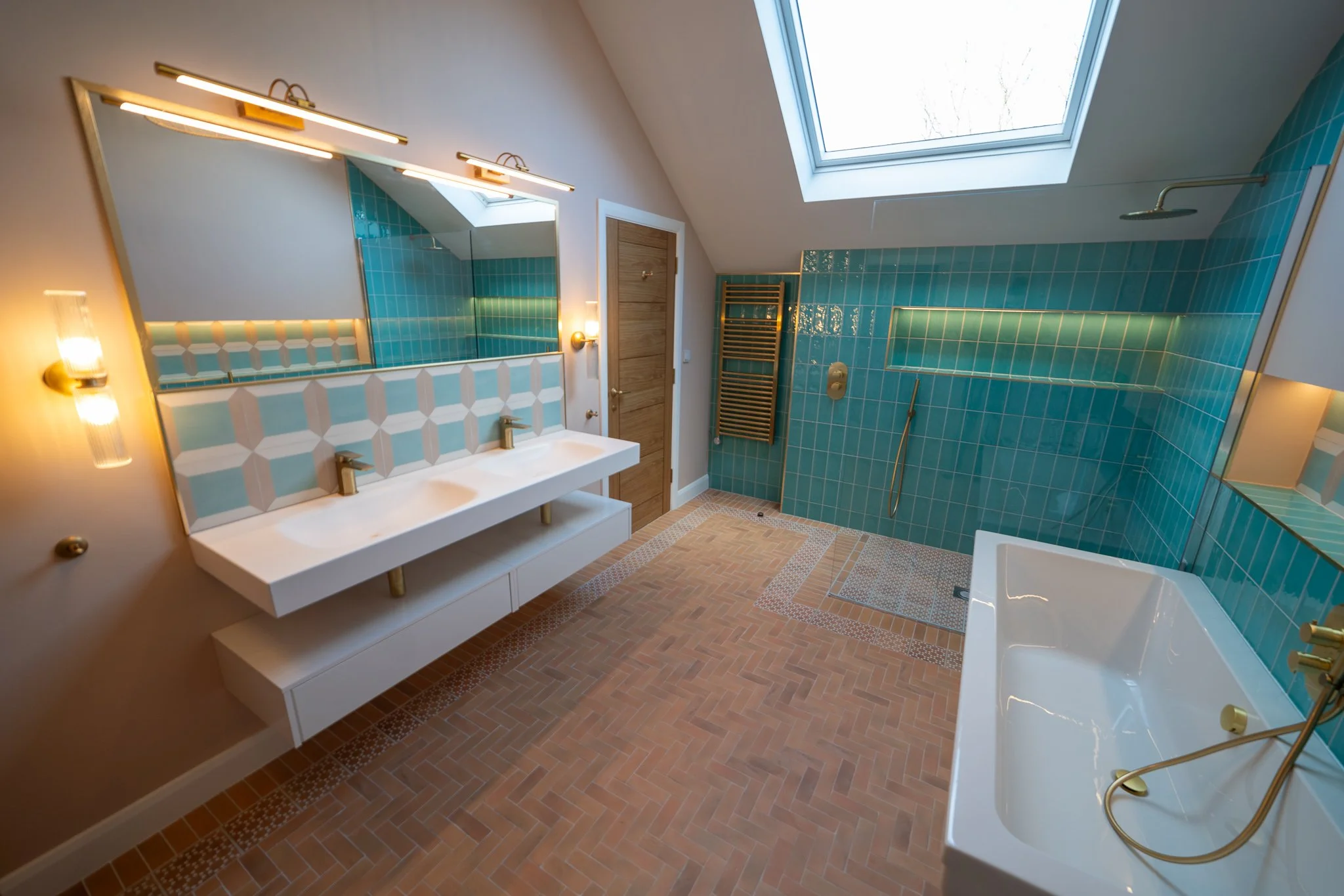
60% white, 30% Dark Green, and 10% Gold. The combination comes together to create a beautiful balance and a visually interesting bathroom.
LET’S Begin!
Now you know how to use colours in your home and how to combine them into something uniquely you! With these tools, you can craft the atmosphere and emotion you want each room to evoke.
For some inspiration on your kitchens and bathrooms, we have you covered! To see how we have applied the rules for our clients, you can check out our portfolio.
Of course, sometimes new colours and furnishings are not enough, and a home needs more drastic action; for that, we are here!
Try our free design consultation and let's create your ideal home together.